30 July 2011

SUMMER OF COLOUR CHALLENGE - WEEK 8 PURPLE!

Purple is a favourite colour of mine but wow I have been seriously lacking ideas!  For the most part I have been doing some basic backgrounds as a starting place for doing a journal (with photos) of a trip to Cuba last May, by finding the Caribbean shade of each week`s colour prompt.

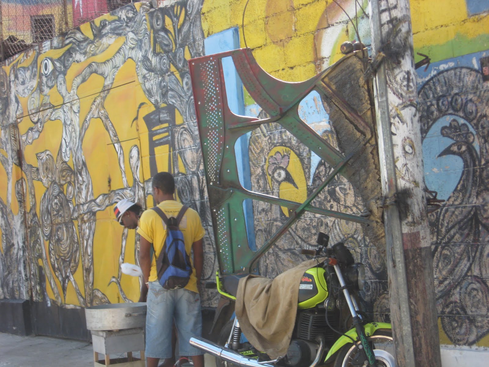
We found out that there has been a focus of resources in the area of art training and support in Cuba.  We saw the evidence of this all over Havana.  The craft market was huge but by and far the numbers of stalls displaying art pieces outdid those with kitschy tourist bits.  I purchased a number of small oil canvasses for six of the grands which I brought home and had framed.  The bright colours and fantasy creatures captured my imagination!   Talking to young woman who created these made purchasing them that much better.  There is a process for taking signed pieces out of the country.  Partly to keep important works in the country but to also have the Cuban artists credited for their work.  None of these are signed pieces and are meant for the tourist trade.  She was quite clear that she should not be credited for these but was delighted that I might use them in my own work.

I started with a shimmery mauve cardstock, which I stamped all over with a wild rose type flower using Dusty Concord Distress Ink.  I printed out scans of several of the small pictures, cut out the creatures and have collaged them onto the page.  I really was tempted to add glitter but as is truly is more reflective of what you see in Cuba.  My scans are more muted than IRL but I think you get a good sense of the vibrancy.

17 July 2011

SUMMER OF COLOUR CHALLENGE - WEEK # 6 RED

It's week 6 of Kristin's Summer of Colour Challenge!  What fun this has been, do check out the submissions and consider joining up - 4 weeks to go!

Gave myself a real challenge this week, why not do something for the first time and put it out for all to see!  I guess that is along the lines of "go big or go home"!   I bought a 10 Seconds Studio metal embossing kit a few months ago and haven't had it out of the bag until now.  I had this vague idea about doing an embossed metal page with the elements to include some religious reference reflective of Cuba.  Lucky for me (!) there is a "Day of the Dead" mold that had included some icons perfect for what I wanted.

The major religion in Cuba is Santeria.  This is a merge of the beliefs brought by slaves from West Africa, the Roman Catholic religion and the traditions of the indigenous population.  There is a link to voodoo in this but I am not well versed enough to explain that!

Antiquing this in black would be an obvious next step on this piece.  However there is very little of that heavy Spanish look to be found in Cuba.  Am I brave enough to apply some blue and perhaps yellow paint to this?  Ha ha - not yet!  I plan this to be the cover for my journal (with photos) of Cuba.


16 July 2011

BOY SCOUT VINTAGE SEMIPHORE IMAGES - A THROUGH I


Alpha, Bravo, Charlie
Delta (my fav!), Echo, Foxtrot
Golf, Hotel, India

Leave me a comment if you would like to have me post the rest of the alphabet.  Remember to click and save the enlarged image.  Happy scouting!

11 July 2011

SUMMER OF COLOUR - WEEK # 5 BROWN

Kristin of Twinkle Twinkle is hosting the "Summer of Colour" Challenge, have you checked it out?  The submissions run to almost every area of art, the inspiration is just incredible.  And you can still join in!

Last week the colour was BROWN!  I thought oh no, not a colour I am drawn to or use much.  I really think of it as one of the "non-colours" - I guess those are any shades that I am not attracted to. LOL   But afterall of that intrepidation, I am pretty pleased with my page.  Absolutely not my usual style and isn't that what a challenge is all about?

My inspiration is again one of my photos from a trip to Cuba in May.  This time a sunset taken from just below Morro Castle, which sits at the entrance of Havanna Bay and was built by the Spanish in 1589.  It is just opposite of Old Havanna but for this picture I have cropped out the skyline of the city which would be on the left.

I started with a sheet of paper made in France "Ecorce Cream", the linear wrinkles seemed to mimic the clouds and waves.  I have used Tattered Angels Glimmer Mists and mists mixed from Perfect Pearls to replicate the sunset in this picture.  I enlarged the picture to a 5x7 so that it dominates the page.  Hard to leave this simple page alone but there you have it.

9 July 2011

BELLA CREATIONS (click here) - JULY MUSE CHALLENGE

All of the new Bella Creations challenges for July are posted!  I always look particularly forward to the Muse challenge - you can do anything you like as long as you use the Muse image!  Provided again for us by GeckoGalz   You know about GeckoGalz don't you?  No excuse, go and check 'em out!   Of course there is always an absolutely lovely prize - supplied this month by our own sweet Bella and Design Team member Cathy.

The July main kit "Southern Charm" is once again so versatile.  I'm inspired to do a bit more home decor projects with the kits, Lacee has quite an eye for putting together supplies that work with most home schemes and papercrafting projects.  Check out the kit at the BellaCreations blog!

I've used the Melissa Frances pps from the "Southern Charm" kit, blue and green Distress Ink and lots of Liquid Pearls to created the layered background medallion.  Pin tucked satin ribbon, vintage silk embroidery thread and more Liquid Pearls create the detail around the base.  I used vintage florist pins and vintage plastic beads to create three stick pins which anchor the thread band.  A strip of vintage seam binding is woven through the top as a final finish.

5 July 2011

SUMMER OF COLOUR - WEEK # 4 YELLOW

It's not too late to join in Kristin's Summer of Colour challenge! There are still 6 weeks to go.  Do go and check out all of the many different projects being submitted each week.  (click on the title of this post, the name of the challenge here or the badge on my sidebar!)

Great plans and all!  I just didn't have enough time to get a background page done this week before leaving for a week.  And YELLOW is a favourite colour of mine!  Most of the interior of my house is a soft buttery yellow colour, you might be surprized what a nice neutral it is in the right shade and how many other colours it goes well with.  Now next week's brown (!) will be a challenge for me...I know it isn't but I have always thought of brown as a non-colour and it isn't one I go to first.

But here are a couple of photos from my Cuba trip that will be the inspiration for my yellow page..well more than a couple LOL I didn't realize that I was this drawn to yellow, I did edit the number down!


Photobucket